Where are Denmark’s coronavirus hotspots?
Our maps show the development of coronavirus infection levels in Denmark over the last four weeks.
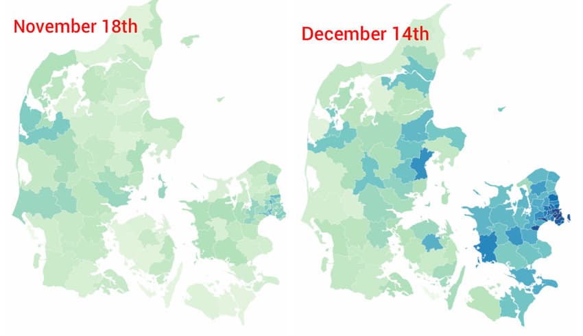
We've taken a look at the latest data for infection levels by municipality in Denmark and compare them in the maps below to the country's infection situation just under a month ago.
Areas close to Copenhagen and much of Zealand are currently showing many of the country's highest infection rates, measured as the number of Covid-19 cases per 100,000 residents over the last week.
Only one of Denmark’s 98 municipalities, southern island Ærø, currently has 0 cases of coronavirus over the last week.
In the late summer, health authorities stated that ‘special focus' would be placed on municipalities in which infections exceeded a rate of 20 cases per 100,000 residents.
The following map shows the new infections per 100,000 residents for the last seven days up until Wednesday December 14th. (scroll over for numbers and municipality name). The data is sourced from national infectious disease agency SSI.
A comparison with a previous map from November 18th, using the same colour grading scale for the infection rates, shows notable changes, with most of the country looking a lot darker, particularly the east. The area around Copenhagen has the higher infection rates on the November map, but that can be seen to have deepened and spread on the newer version. Improvements in infection rates can be found in a very small number of areas. Most have got worse.
The November 18th map can be seen below.
It should also be noted that municipalities with very small population sizes will show a high value for the measure even if they have only a handful of cases.
In the next map, you can see the raw numbers of individual cases of Covid-19 registered in each municipality. Bear in mind that larger population areas will naturally tend to have higher raw numbers of cases.
Comments
See Also
We've taken a look at the latest data for infection levels by municipality in Denmark and compare them in the maps below to the country's infection situation just under a month ago.
Areas close to Copenhagen and much of Zealand are currently showing many of the country's highest infection rates, measured as the number of Covid-19 cases per 100,000 residents over the last week.
Only one of Denmark’s 98 municipalities, southern island Ærø, currently has 0 cases of coronavirus over the last week.
In the late summer, health authorities stated that ‘special focus' would be placed on municipalities in which infections exceeded a rate of 20 cases per 100,000 residents.
The following map shows the new infections per 100,000 residents for the last seven days up until Wednesday December 14th. (scroll over for numbers and municipality name). The data is sourced from national infectious disease agency SSI.
A comparison with a previous map from November 18th, using the same colour grading scale for the infection rates, shows notable changes, with most of the country looking a lot darker, particularly the east. The area around Copenhagen has the higher infection rates on the November map, but that can be seen to have deepened and spread on the newer version. Improvements in infection rates can be found in a very small number of areas. Most have got worse.
The November 18th map can be seen below.
It should also be noted that municipalities with very small population sizes will show a high value for the measure even if they have only a handful of cases.
In the next map, you can see the raw numbers of individual cases of Covid-19 registered in each municipality. Bear in mind that larger population areas will naturally tend to have higher raw numbers of cases.
Join the conversation in our comments section below. Share your own views and experience and if you have a question or suggestion for our journalists then email us at [email protected].
Please keep comments civil, constructive and on topic – and make sure to read our terms of use before getting involved.
Please log in here to leave a comment.